BOLT
I designed a mobile application for users of public transportation in their respective cities. This app was designed to help both people new to public transportation and frequent users.
A Public Transportation App
Project Brief
This was my first mobile app design as a student at Bethel School of Technology. I was given the prompt of developing a simple and user-friendly mobile app to help users travel around their city in a more efficient way. My whole life I have never used public transportation, so this was a real challenge that I was excited to embrace and learn along the way.
Role- Product Designer
Timeline- January 2022- March 2022
Tools- Figma, Zoom, Notion, Gmail, Slack
Are people having issues finding reliable transportation? I sat down with five potential users aged 21 to 46. Each participant gave great insights during the 30 minute long interview process. I also surveyed a minimum of 25 users with a Google Survey.
User Research
81% of users would like a more time efficient product to use while in a hurry.
62% of users would like a detailed map/location feature when they move to a new city or are just visiting.
82% of users would like to be notified quicker of any transportation changes or quicker routes.
87% of users would like to have all of their addresses traveled to be saved if need be to make the next travel experience easier.
My survey yielded the following results–
While most of the people surveyed are not frequent users of public transportation, they expressed interest in quicker and less time-consuming ideas for a time they do in fact have to use public transportation.
Vision & Plan
Users require a detailed map of their current location for city navigation, along with frequent notifications about upcoming travel to stay on schedule. They would also appreciate the ability to schedule their departure times in advance.
Additionally, users should be able to enter and save multiple addresses for the best available ride options. All addresses will be saved to the user's home screen, eliminating the need for manual entry within the app.
Identifying Users & Pain Points
To better understand the needs of the users, I developed two personas.
Based on my research, I created an experience map, which organizes all features of the app. It captures the actions taking place at each step.
Mapping The User Experience
Laying Out The Features
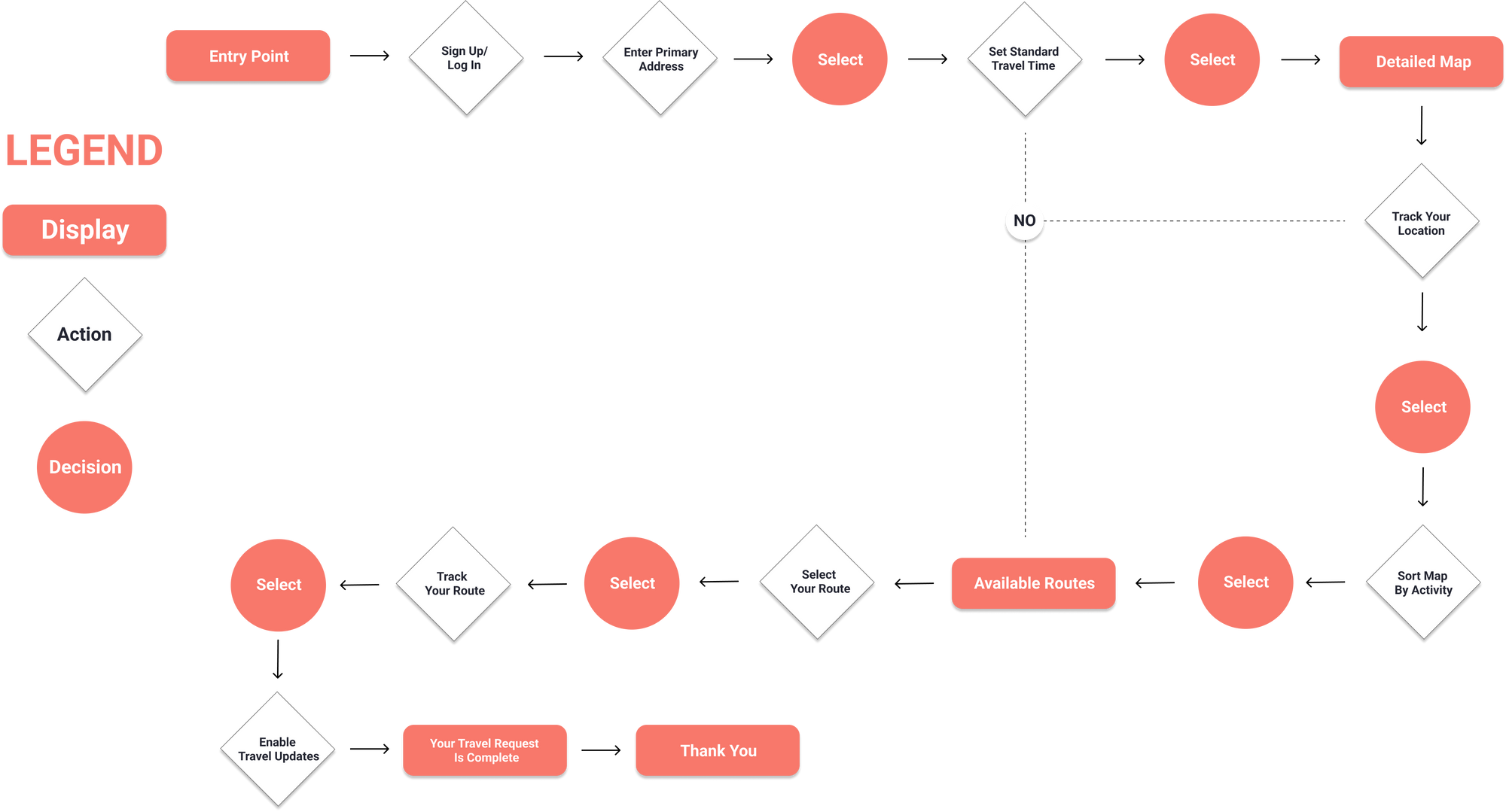
I created a user flow based on my ideal user journey to plan out how the app would flow. Users needed to be able to find public transportation just as easily as they could browse Uber or Lyft.
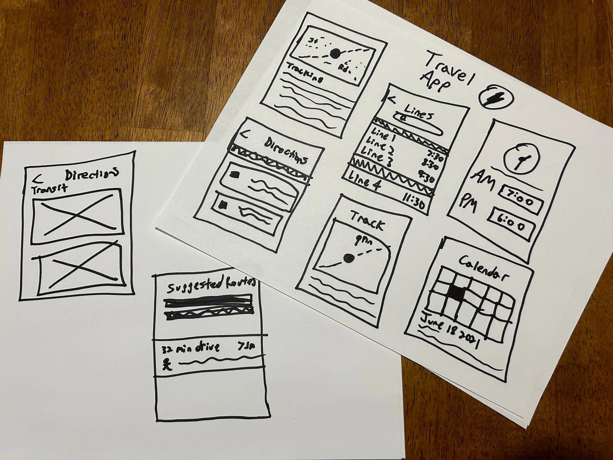
After concluding my information architecture and user research, I began sketching out my vision for what Bolt would look like. Below are a few sketches that established the creative direction for Bolt moving forward.
Sketches
Building The Wireframes
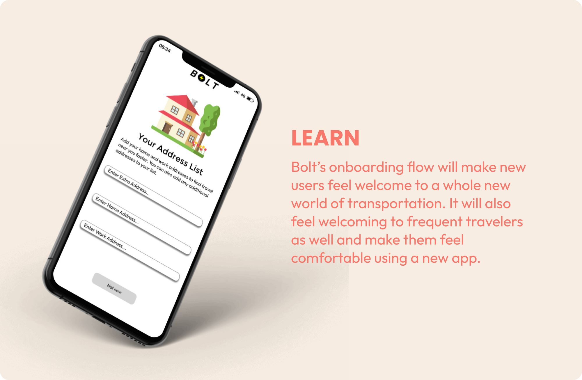
I have started designing screens to create an onboarding flow for users. The flow will include creating an account and going through four welcome/tutorial screens. On the main page, users can select their preferred mode of transportation from three options: "City Bus," "Trams," or "Trolley Bus." They can also switch between map and list views and set up "Morning and Evening Departure" times.
When a mode of transportation is selected, users will be shown the quickest route and receive updates on faster buses or trolleys nearby. Users can also search for destinations near their location and get the best public transportation options. Finally, the "Profile" page displays miscellaneous information about the user's account and settings.
User Analysis
After designing my first set of gray scale wireframes, I conducted brief user testing to gather information on how I could improve the design. Conducting brief user testing with my wireframe prototype provided some excellent feedback.
Users feel more comfortable with a minimal page layout.
Users felt there was too much going on in the “Lines” layout.
Users felt the “Evening & Morning Departure Times” wasn’t necessary for the home screen.
To create a consistent and strong design, I created a simple style guide for the designs of my wireframes. I used colors, illustrations, and typography throughout the app design. I wanted Bolt to have an eye-popping color scheme that grabs your attention.
Creating The Style Guide
Ready To Bolt!
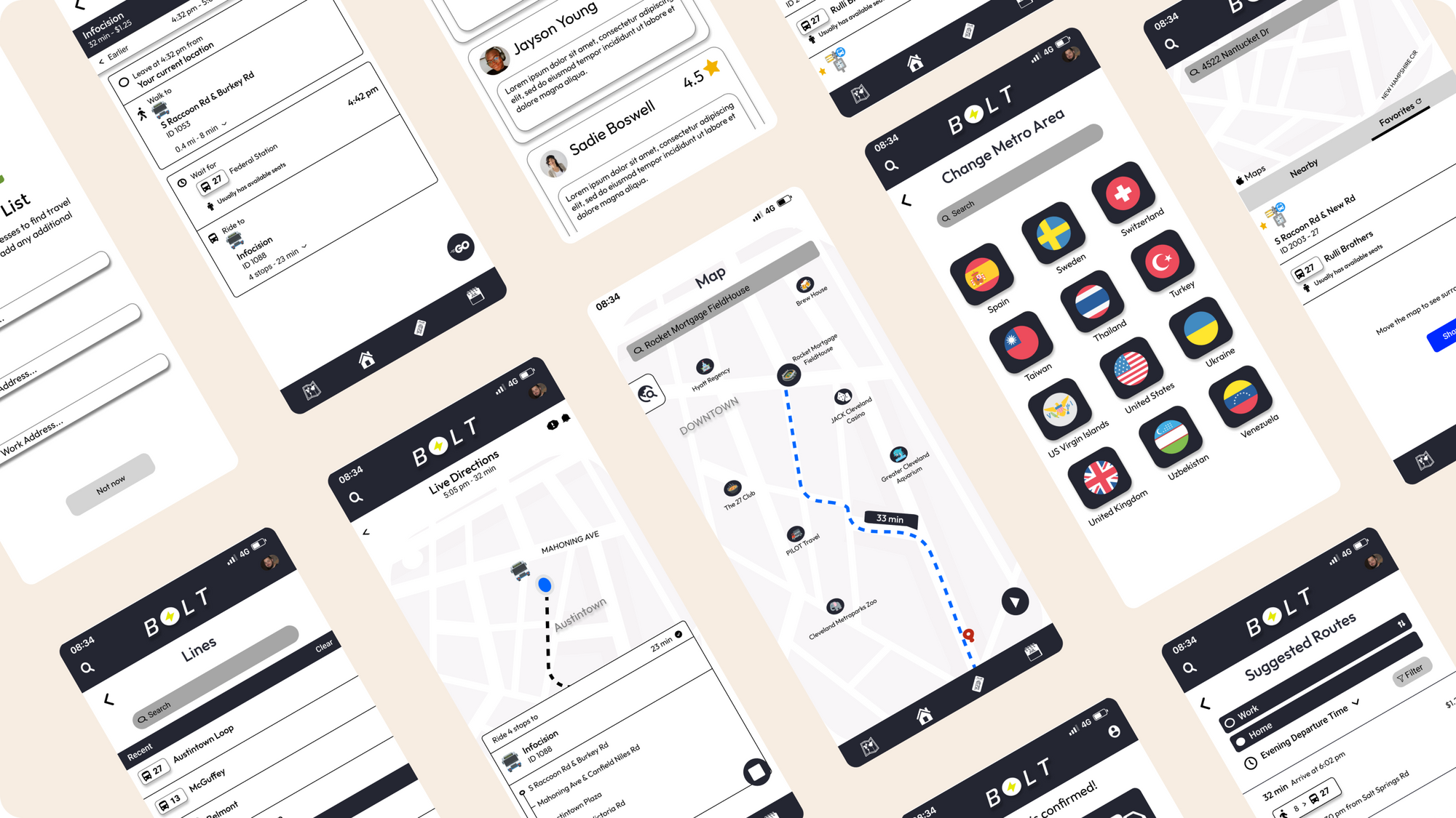
Taking into consideration all of the feedback I received from research and testing, I designed hi-fidelity wireframes to showcase the finished product. New users feel right away that they will be taken care of embracing new travel solutions.
Final Design
Creating this product has been a tremendous experience for me as a growing designer. Along the way, I learned a lot about myself and my creative process. While developing this product, I faced creative blocks and had to take several breaks to clear my mind. These experiences make me a better designer and provide valuable teaching moments. I still have a lot to learn, but after this assignment, I feel more confident than ever in my abilities!


